Thursday, December 20, 2012

Visual Techniques

Translucent Speaker by People People


  • Transparency
  • Asymmetry
  • Simplicity
  • Accuracy
  • Depth 


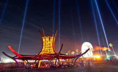
Pagoda by The Do Lab


  • Accent
  • Symmetry 
  • Curvy
  • Consistency
  • Repetition

The Pagoda strikes me as grand. When I look upon the huge arcs that form its body, I see the great circles that they imply. The Pagoda's radiance and symmetry make it shine like a beacon in the night sky. For these reasons the Pagoda is a bold design, which intrigues the viewer to come sit under its spires. In contrast, the Translucent Speaker is very subtle and minimal in impression. The speaker's translucent body reveals the inside, and at the same time demands no visual attention. The various speaker cones connecting to the power module make the speaker asymmetrical and provide a feeling of technical precision. The two objects have opposing traits that lead to their success as designs.

Thursday, December 13, 2012

Contrast

Eggwave - by Werteloberfell for Neff


The Eggwave, designed by German design group Werteloberfell for refrigerator manufacture Neff, is an elegant take on the traditional egg carton. The tray's form flows with a series of peaks and valleys that mimic the shape of an egg. The undulating plastic structure of the carton is an effective use of contrast for two reasons. First, each positive and corresponding negative spaces provide both a cradle for one egg and a cap for another. The symmetrically contrasting form of the carton unit allows for an almost infinite expansion of egg containment in two dimensions. Eggwaves can be stacked both vertically and horizontally, while maintaining a modular and rigid structure. Additionally, the elegant contrasting sine waves of the Eggwave combine to create a sculptural element for your fridge. This makes consumers less likely to simply dispose of the Eggwave, but rather cherish it for its sculptural value. For its functional and sculptural qualities Eggwaves use of contrast makes it successful as a design.


Sky UI


The user interface for Sky, a web app, is designed with a sexy clean aesthetic that looks in par with our modern design sensibility. However, the design ultimately fails because the interface and buttons lack proper contrast, both from themselves and the rest of the apps content. The app's background is a cool grey-blue gradient to white. This is usually a calm and approachable style for a web app, but there is no contrast between it and the "buttons," they are also blue and (slightly less) cool blue. Additionally, there is no contrast between the Interface "buttons" themselves. Each "button" has the same blue with light sheen surface and a white symbol – at a quick glance they are impossible to differentiate. For these two reasons Sky's UI's lack of contrast makes it fail as a design.

Thursday, December 6, 2012

Motion in Interface

MAMUS - Creative Agency

(http://www.mamusinc.com/)

MAMUS Inc.'s interactive website uses motion to deliver a beautiful experience and give the user an understanding of the content flow, while showing off the agencies creative side. 
  
On load, the site displays a gutter-less grid of images at around 80% percent opacity. 


When a grid image is hovered over, the image slides up and a short description slides down with an option to click and view the project in greater detail. Of hover, the description retreats and the grid returns to normal. This expansion and contraction of content allows the user to get a glimpse of a project before committing to viewing it in depth.  


When an image is clicked on, a mostly opaque layer slides over the home grid and larger images of the selected project fill the screen, as well as a description box. Upon clicking the "X" (signifying "close"), the large images fade out and the white layer slides back up returning the user to the home grid. 

The flow of movement used by the site's designer allows for the user to dive into the content without without loosing reference of how they got there. Additionally, the sites motion solves the problem of information size; with simple motion and interaction with the user greater and greater information can be displayed (small image > small  image + description > multiple large images + in depth descriptions). 


Square Inc. - Mobile Payment Platform

(https://squareup.com/careers/creative)

Square's webpage for creative talent recrutement uses smooth scrolling-triggered motion to convey their hip, high tech mentality, and be an eye-catcher for job-seeking creatives. 

As you begin scrolling down the "Creative Careers" page, your first stop (after the inspirational quote and video) is industrial design. Their flagship card reader is displayed, along with a technical and conceptual drawing.

The rendered (real looking) card reader image begins to move with your screen as you attempt to scroll past it. 

An iPhone comes into view as you keep scrolling (card reader still fixed on screen) and as you arrive at the product design section the card reader slides right into the iPhones headphone jack (really natural feeling). 

Continuing down the page, the unfolded packaging for Square's card reader comes into view.

Upon the whole packaging becoming in view, the front flap folds over revealing the page's print and packaging design section. 

Not only is Square's site's motion beautiful, but it solves the problem of conveying their intent to potential applicants. The message is, "We really care about design," and it's said loud and clear. 

Thursday, November 29, 2012

Dimension | Depth | Space


Video can be viewed here: http://youtu.be/bBQQEcfkHoE

Head Tracking Displays and Interfaces

As digital interfaces and computer displays become more and more integrated into the daily lives of so many people, a common problem that arises is the need to be more immersed in the content that the 2-dimensional screen will allow. Many companies are working on applying motion-tracking technologies to mobile device hardware in attempt to solve this problem. 

The solution is displays that can track the user's head/eyes and render the content adjusted to any movement. This adjusted rendering provides the user with a feeling similar to a "3-D" display. As the user moves their head side-to-side, the camera tracks their movements and renders the content to appeal to their visual depth cues. Lines converge to a vantage point, stimulating our perspective depth cue. Elements that are meant to be perceived as closer are larger, and visa versa, stimulating our relative size depth cue. When the user's head moves, visual elements that are meant to be perceived at varying depths will overlap one another and stimulate our occlusion depth cue. Additionally, these screens can stimulate our oculomotor depth cues of accommodation, stereopsis, and convergence as our two eyes move to track rendered objects.

The mobile device of the future.

Thursday, November 15, 2012

Tone and Color

http://www.dannewton.com
I will be using the portfolio site of photographer Dan Newton as an example to analyse how tone and color can be used for interactivity and user understanding. 

How is TONE operating

In this user-interactive photo gallery, tonal elements operate as the foundation from which the artist displays his work. The site's background image, both navigation systems, as well as half of the artist's name are in grayscale. This allows for the fundamental elements to be clear and understandable, while not distracting from the content.

How is TONE interacting

Tone interacts with the user in various ways. When the user hovers over a page navigation item the item grows in size, and also transitions from white to black along the the greyscale. This show a transition of importance and cues the user to click and progress through the site. Additionally, on page load, the sites background image is in full-color. Then, after clicking on a navigation link, the background image transitions to greyscale and full-color image gallery appears in the forefront of the screen. The once important background image thus relinquishes its focus to the new user spotlight and recedes in hierarchy. 

How is COLOR operating 

Color operates a as a tool for user focus and information hierarchy. First and foremost, the large format image galleries, the reason the user is on the site, are one of the only page elements in beautiful full color. This establishes the image galleries as most important–as they should be. Secondly, the last name of the photographer, Newton, is sitting in the top left corner in vibrant red, while his first name, Dan, remains white. This creates, within the hierarchy of the site, the notion that "Newton" is more important than "Dan" and the rest of the page–except for the the images. 

How is COLOR interacting

Color interacts with the user primarily as the user interacts with the image gallery navigation at the bottom of the page. The image that is shown large format is also in full color within the galleries navigation system. As the user hovers over other images, they too transition to color, and back out when they loose focus. 

Thursday, November 8, 2012

Installation Architecture

Within the domain of installation architecture lie the same basic elements of visual composition that pertain to any discipline. I will focus on Line, Shape, and Direction as a means to expose their application in the light of installation architecture.

Line

The pavilion installation C-space relies solely on lines to define its complex curved form. The designer's use of line rather than solid material allows the pavilion to visually be a single shape while maintaining a relatively light profile. The use of line in this project also makes C-space an installation, rather than a permanent structure. The lines used to construct the form can be dismantled as easily as they were assembled, then taken a new location or decommissioned permanently. In this example line carries over directly from the design phase to the final result of the project.

Shape 

The shade structure above, by architect Sanjeev Shakar, is shaped in an upside-down arch made of 945 cooking-oil cans. Shape is prominent in this piece of installation architecture because one shape defines another. A grid of arrayed squares with rounded corners (oil canisters) is arched backwards by the weight of gravity and the proximity of it two ends. This displacement make the overall structure form a smooth semi-circular arch. Both of these shapes are mellow and pleasing, which attracts citizens of the village to come sit underneath the structure and escape the shade.

Direction

Gabriel Dawe's installation The Density of Light is a powerful example of direction within the domain of installation architecture. The colorful giant is composed of thousands of pieces of string arrayed from ceiling to floor. These pieces of string start from points on a ground line and converge at the ceiling, creating an apex for the eye to move toward. This convergence defines a clear compositional direction of the conscious eye and the overall installation. 

Thursday, October 18, 2012

Visual Feature Hierarchy - APC40

Top view of Akai APC40

Top view plus annotated control groupings

The Akai APC40 is a multifunctional piece of music making hardware designed for performing DJs. The equipment as a whole, and its subcomponents (knobs, buttons, and faders), correspond directly to the DAW (Digital Audio Workstation) Ableton Live. 

The large array of buttons, knobs, and faders on the APC40 are arranged to correspond with their function within Ableton; for example, the large 8x8 grid of squares in the upper-left of the device are each assigned to sounds or loops within Ableton, and are activated when pressed. Thus, highest in the visual feature hierarchy of the object is spatial layout. 

Next down the feature hierarchy chain is shape. Each control has a unique shape that corresponds to the function under its command. Faders are sliding rectangles, volume controls are round knobs that turn, and squares activate sound as well as other functions. 

Finally, color is the last visual feature used in the object's hierarchy. When an effect, noise, loop, or track is activated in the program, the corresponding button, knob, or fader is illuminated on the hardware. Green signifies active, red signifies stop, and flashing red signifies about to stop. 

The Akai APC40 with all its functionality must make use of visual feature hierarchies and does so excellently. 

Thursday, October 4, 2012


The Rock Stadium, by MZ Architects is an example of effective visual syntax guidelines. The stadium, soon to be built in the UAE, displays use of balance as well as positive and negative space. The balance used in the structure is level; there are clear visual axises that are effective in the structures function. The balance draws clear lines to the openings of the structure, and allows for the smooth transition from desert to roof in a single plane. The stadiums positive/negative balance is also important for its function. The positive space creates protection from the harsh desert sun, while the negative space lets light shine down upon the field.


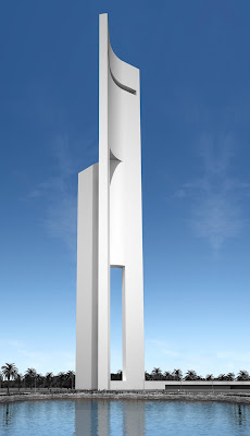
Eolica, by Fran Silvestre Arquitectos, is an example of ineffective visual syntax guidline use. The tower which is intended to allow for spectacular views across the reflecting pool from the towers top, actually prevents views because of its sharp, unbalanced, angle of viewing. 

Thursday, September 27, 2012


This image is a visual representation of the economy (found via google image search). The word "MONEY" is clearly visible as the headline of a news article–probably the daily economic report–and adjacent to the headline, the title "The Wall Street Journal" fades into the background of the image. Superimposed with the text is an ambiguous graph and the grid lines that define it. 

Feelings:

  • Crashing
  • Mysticism
  • Complexity
Symbols:

  • Graph: denotes a fluctuation of market values.
  • Wall Street Journal: denotes an authority figure.
  • "Money": denotes power, class, and prestige.
The composition of the image plays a large roll in influencing my reactions towards the image itself. The superimposition of multiple raw images give the image the mystical sense–fading in and out. Also, the use of a graph, striking through the image, makes the composition feel complex and powerful.

Thursday, September 20, 2012


Caitlind Brown’s project, The Could, is an interactive installation composed of six-thousand burnt-out lightbulbs placed in mass to form a cloud. The project contains examples of Representation, Abstraction, and Symbols.

Representation:
The strongest visual element in the composition is the cloud. A floating amorphous mass represents the form of a cloud. To the viewer, the cloud form is attractive because of its unusual tangibility. A cloud is usually something that can only be seen from a distance, but here it is represented as a physically interactive object. The cloud form is the large scale impression of the abstraction, and an essential compliment to the project’s symbolic meaning.

Abstraction:
In the composition, lightbulbs become abstracted to merely a pixel in the cloud’s radiance. The lightbulb’s abstraction becomes less apparent as the viewer moves closer to the cloud. The whole form gives way to the individual when the viewer gets underneath, abstracting from the form of cloud to a mass of orbs. At an intimate scale, the abstracted lightbulb is a more meaningful element of the projects representation and symbolism alike.

Symbols:
The cloud of lightbulbs denotes the colossal amount of energy consumption that hangs over every individual’s head–floating behind us like a cloud. In the installation, this symbolism is felt by the individual as they pull on the strings raining down from the cloud. As they pull, a bulb is turned on or off; and, when seeing your own actions in such proximity of your neighbors, you get a sense of the impact of flipping on a light. The symbolic impression that the cloud emits is achieved through the collaboration of both the cloud representation and the abstracted lightbulb.

Thursday, September 13, 2012

Representation


This photograph, Pole Star and Milky Way, by Michael Holden, is an excellent representation of this magnificent structure captured at the Oregon Country Fair. The image that Michael captured provides a direct reporting of the visual details, to an almost surreal level, possibly due to an extended exposure. For me personally, this representation evokes a flood of memories from the times I spent at the event and to the beauty of being beneath the structure in person. To others the beauty may go no deeper than the rich colors and deep shadows in front of a starry night sky.

Abstraction


The Umbrella Man, by G Crackle, is a piece of multilayered stencil art, and thus by nature an abstraction. The artist captured the refined essence of the umbrella man by only emphasizing the textures necessary for comprehension. The suit is textured only to show the press of the man's form. Likewise, by contrasting the solid shapes of the man's head and tie in dark blue, against the white of the mans shirt and the back drop, these two forms become dominant–and rightfully, they are defining characteristics of the figure. 

Symbolic


The logo used to represent the Burning Man community is very symbolic. The most important element of the symbol is "the man". "The man" very clearly represents to me the unity of mankind, and mankind as a whole. The symbology of the man becomes apparent to oneself as "the man" burns. On the second to final night of the gathering, a towering structure of "the man" is burned in a celebratory ritual. The second element of the logo, the radial sweep from one hand to the other, denotes the Black Rock City (the city formed at burning man) as a whole. The black Rock City plan is designed to be a clock, containing linear streets each at 15 degrees off the center, and radial streets growing as they get father from the center. The entire city revolves around the man who stands tall at the cities vertex.